 Live Chat
 Contact
 Shopping Cart
 Touseef Manzoor
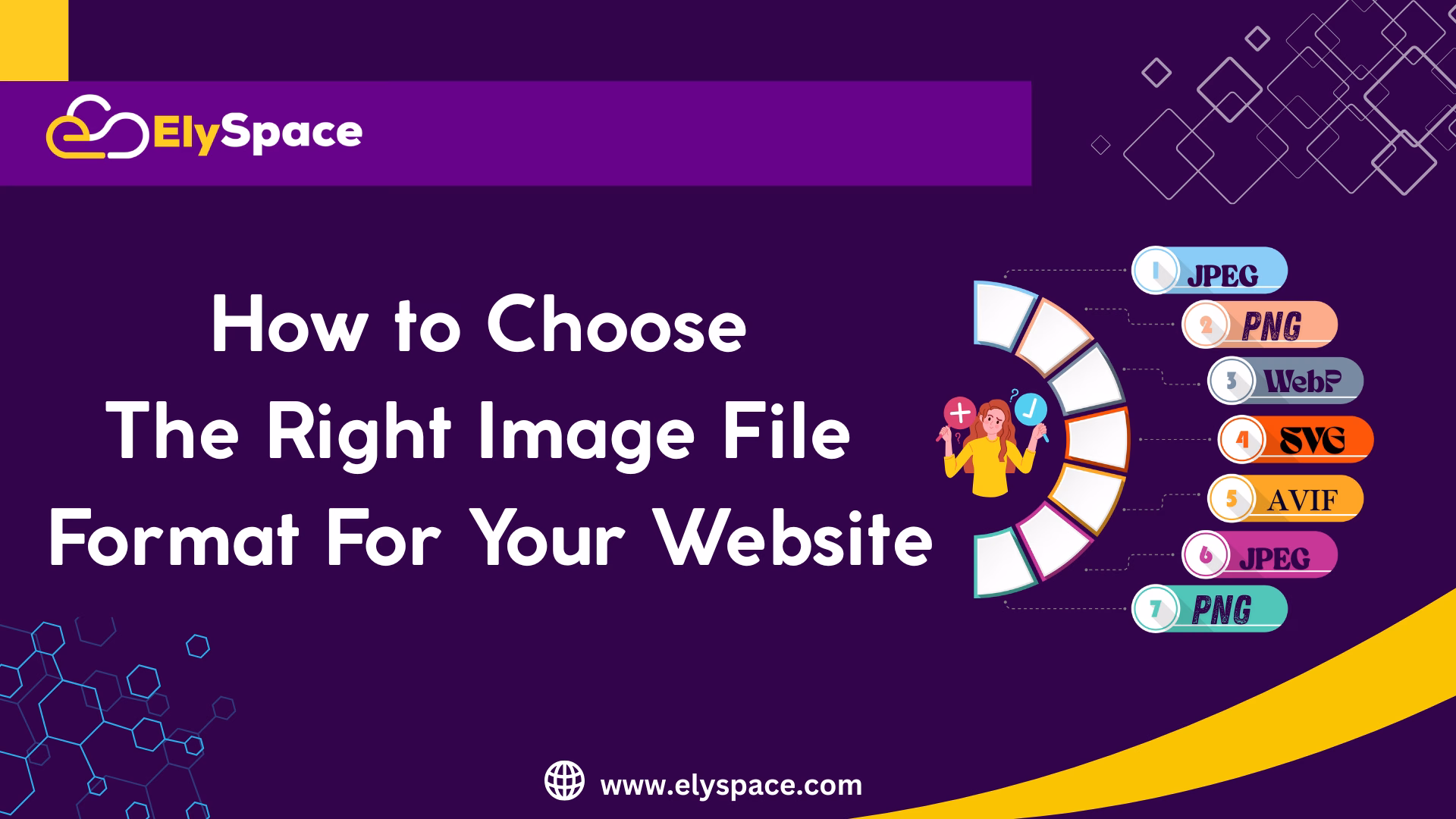
Side-by-side comparison of identical image in JPEG, PNG, WebP and SVG formats showing quality differences and file sizes
Imagine this: You have put the finishing touches on a lovely website, have uploaded the images you want, and clicked publish. But when you go to see the site, it loads at the pace of a snail, or worse, the photography you worked so hard on ends up looking crunched flat as a pancake. Sound familiar? You’re not alone.In this tutorial, we will discuss how to choose the right image file format for your website.
Selecting the appropriate image file type can feel like deciphering a code, especially while being confronted by images represented with using several options on the internet, such as JPEG, PNG, WebP, and SVG. The truth is – it can make or break your website, it’s that important. The best part? Once you know the basics, it’s not that difficult.
Getting to Grips with the Image Format Scene
Now we’re ready to get into everything you need to know about the image file formats so that you can make smart decisions to keep your site quick, appealing, and search engine friendly.
Understanding the Image Format Landscape
Before we get into formats, it’s important to cover what we are talking about here. Each image format is basically a unique storage and display method of visual information. Some image formats conserve file size, others conserve quality, and some provide a balance of both.
You might consider your image format selection similar to a choice on how you will travel on your journey. A sports car is excellent for speed as long as you are driving on smooth, paved roads, but you wouldn’t take it very far off-road. Similarly, each image format shines in certain areas and is best on certain ‘paths.’
The balancing acts will always be file size, image quality, browser compatibility, and loading speed. In some cases, you may choose to sacrifice a little image quality for a faster loading time, and in other cases, you might choose a larger file size so you have crystal clear, beautiful images.
JPEG: The All-Purpose Image Format
JPEG (Joint Photographic Experts Group) is likely the image file type most of you are familiar with. It has been around since the early 90’s and it is still the preferred file type for photographs and images with a lot of detail.

Professional photograph in JPEG format demonstrating excellent color reproduction and compression efficiency for complex images
What makes JPEG unique is that it is lossy compression, or it discards some image data in order to make file sizes smaller. Before you freak out, that isn’t always a bad thing since the human eye can’t always see the difference, especially when done right. JPEG does a phenomenal job with photos, realistic art, or any more real color transition/gradient image. If you share a photo of an amazing sunset, a photo of your product, or a team photo from headshots, JPEG is your best option overall.
JPEG does have limitations. JPEG does not have transparency so you cannot have those nice cutouts on your image that will blend normally with your background. JPEG does not process images that have sharp edges, text, or simple graphics well; they tend to become blurry or pixelated.
When to use JPEG:
Photographs and realistic images
Complex artwork with lots of colors
When file size is more important than quality
Banner images and hero photos
E-commerce and product photography
PNG: The Quality Champion
PNG (Portable Network Graphics) was created to improve legacy formats, and it does just that. While JPEG is built on lossy compression, PNG uses lossless compression- you get exactly what you put in, with no data thrown away.
The true super power of the PNG format is transparency support. You can have images with transparent backgrounds, that will blend perfectly with your website designs, allowing for a wide range of options. This makes PNG great for logos, apps icons, and any graphic content that need to sit cleanly on different colored backgrounds.
PNG has two main variants: PNG-8 and PNG-24. PNG-8 supports up to 256 colors, and creates files that are smaller, while PNG-24 supports millions of colors, and files that are larger. For most logos and simpler graphics, PNG-8 is perfect and keeps the file sizes more manageable.
The downside; PNG’s can be considerably larger than JPG’s, especially with complex images. A photo that weighs in at 200KB has the potential to become 800KB in PNG format. That adds up quickly and can bog down your website.
When to use PNG:
Logos, Branding elements
Icons and simple graphics
Images needing transparency
Screenshots with text
Line art /illustrations
When image quality is absolutely paramount
Photographs and realistic images
Complex artwork with lots of colors
When file size is more important than quality
Banner images and hero photos
E-commerce and product photography
WebP: The 21st Century Sensation
WebP is Google’s response to the age-old conflict of file size and idiosyncratic image quality. It’s relatively new, provides lossy or lossless image compression, transparency, and animation.
What’s special about WebP is its efficiency. You often achieve the same visual quality of a JPEG format with a file size that is 25-35% smaller. PNG images will sometimes show even greater savings. That’s great news when it means websites load quicker and users are happy.
File size comparison chart showing WebP format achieving 30% smaller files than JPEG while maintaining identical visual quality
WebP also improves on PNG transparency, by providing an even smaller file size. This makes WebP a perfect compromise when you would like transparent backgrounds for a logo, icon, or graphic, but the PNG file is too large.
The downside? Browser support is good now, but it has not always been so universal. Modern browsers seem to like WebP but providing a fallback for older browsers might still be a good idea, however good WebP is.
When to use WebP:
When you want to accomplish the best of both worlds (quality with small file size)
Modern websites focused on recent browsers
High traffic arrangements where every KB is too large
Online stores that require images of numerous products
Mobile-optimized websites
SVG: The Scalable Format
SVG (Scalable Vector Graphic) is the polar opposite from the other formats discussed so far. Rather than storing pixel information, SVG stores mathematical parameterizations of shapes, lines, colors – just about anything you could think of. Because of the nature of SVG, this means images can be scaled to any size because they are just mathematical shapes.
Think about the difference between a photograph (raster) and an architectural blueprint (vector). A photograph shows you what something looks like at a certain size while a blueprint provides you with the instructions to represent that object at any size you want.
Most SVG files are quite small for simple graphics, and are excellent for icons, logos, and illustrations. SVG also allows for interactivity (e.g. mouse-overs) and animation (using CSS and Javascript), which enables creative possibilities.
The only limitation? SVG only works well for simple graphics. It is practically impossible to create a realistic photograph as an SVG— it would be massive and defeats the advantages of an SVG file in the first place.
When to use SVG:
Icons, clips and simple illustrations
Logos that must maintain scale absolutely
Graphics that with will be presented at more than one size
Devices that require retina/high-DPI graphics
When you want to be able to style graphics with CSS
AVIF: The New Player on the Block
AVIF (AV1 Image File Format) is the new kid on the block in the realm of image formats, and it can do some amazing things. Derived from video compression technology with still images, AVIF can compress better than WebP while delivering higher quality.
In initial tests, AVIF is able to lower file sizes by 50% movement than JPEG at better quality. AVIF mode supports transparency, high dynamic range (HDR), wide color gamuts – it basically supports everything for the modern web.
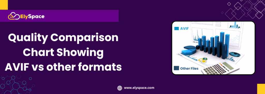
Image quality comparison chart demonstrating AVIF superior compression efficiency compared to JPEG, PNG and WebP formats
The one wrinkle is that AVIF does require browser support, and is still rolling out on different browsers, so you’ll have to create fallback options to ensure user access to the content. But if you’re planning and considering the future, AVIF should certainly be on your radar.
Making The Best Decision: A Useful Decision Framework
Now that you have enough information to examine the options, how do you choose? Here is a useful decision tree that will serve most situations:

Infographic titled ‘Choose the Right Image format like JPEG, PNG, GIF, and WebP, with pros and cons or best use cases for each format.
For photographs and complex imagery:
Is file size critical? WebP with JPEG fallback
Maximum compatibility? JPEG
What about the future? AVIF with JPG/WebP fallbacks
For logos and graphics:
Is it line art or text? SVG
Transparency and a small file size? WebP or a PNG-8
Perfect quality and no file size limits? PNG-24
For icons and UI elements:
Solid colors and simple shapes? SVG
Complex icons with multicolor gradients? PNG or WebP
Retina? SVG or 2x PNG images
Optimizing images for web performance
Choosing the right format is only half the battle. By itself, the best format doesn’t matter at all if you don’t optimize your images properly. Some key optimizations to think about:
Make sure to size your images correctly:Uploading a 4000×3000 pixel image is unnecessary if that image displays at only 400×300 pixels. Images should be sized as large as the display pixels with a slight increase for high-DPI screens.
Compress your images wisely: Most image editing programs have settings for compression. When saving JPEG images, maximum quality settings in the 75-85% range typically keep the file size down while still maintaining acceptable quality.
When saving larger images that will be displayed in a larger format, consider using progressive JPEGs that provide a series of loading images so that the viewer can see something while waiting for the full-image download.
Consider lazy loading on images shown below the fold on the web page:This will only load images when the user scrolls to them to improve the page load speed when users first land on the page.
SEO and Accessibility Considerations

Collection of tools and resources used for image optimization, including software icons and performance graphs
Search engines cannot “see” images the same way a human would, but they can use other signals to try and figure out what your images contain. Proper optimization for your images is important for SEO.
The power of alt text! Each image needs descriptive alt text that describes what the image is and why it is pertinent to the content. Don’t just write “image of product”, instead be descriptive: “red leather handbag with gold-colored hardware on white background.”
File names are important too. Rather than “IMG_1234.jpg,” use descriptive names too: “organic-coffee-beans-roasting.jpg.” This will allow search engines to index your content correctly and it can actually send some traffic from image search!
Remember accessibility as well. Images that convey information should have alt text that conveys that same information. Images that exist just for decoration can have an empty alt attribute (alt=””) to tell the screen reader to skip them entirely.
Tools and Resources for Image Optimization
Optimizing images can be done for free (or very low cost) and without any fancy software. Below are some decent tools that I like:
The online optimizers look great too. TinyPNG, ImageOptim and Squoosh are a few I like to use, since they allow you to compress images on the fly without a software install. They provide a fast solution for occasional use, or for compressing a few images.
For bulk optimizers, consider ImageOptim (Mac) or FileOptimizer (Windows) which allow you to batch process hundreds of images automatically.
If you are using a WordPress site, consider a plug-in like ShortPixel or Smush, which can automatically optimize images as they are uploaded.
Developers can consider command line tools like imagemin or an automated build process to optimize images as part of their workflow.
Future-Proofing Your Image Strategy
The web will always change, as will images. Here’s how you can be prepared:
Use responsive images using the element and srcset attribute to serve images in the format or size that best suits their browser and device capabilities.
Consider a CDN (content delivery network) that will take care of optimising images. Services such as Cloudinary or ImageKit can automatically convert images to the best format for every visitor.
Think about a content delivery network (CDN) that can automatically optimize images. Services like Cloudinary or ImageKit can automatically transform images to the best format for any visitor’s browser.
Stay updated on new formats. JPEG XL is emerging as another promising image format. While it is not widely supported yet, following this trend helps you plan for the future.
Common Mistakes to Avoid
Even with the best intentions, it’s easy to make mistakes with image optimization. The most common ones happen when you do any of the following:
PJGs: Using PNG for everything because “it’s higher quality.” Although PNG may give you a bit better quality, the file sizes are enough to certainly slow your website down.
Forgetting about mobile users: Big images that look good on desktop can have painfully slow performance on mobile and on slower connections; you should always be testing and optimizing your site on mobile devices and slower connections.
Ignoring browser support: Look, modern formats like webP and AVIF offer useful benefits, but you need to have proper fallbacks for legacy browsers.
Speaking of fallbacks: Not using alt text and filing names is a missed opportunity for both SEO and accessibility.
A Wrap Up

Summary of key points about image optimization tools and best practices.
Choosing image formats isn’t searching for the one solution. It’s understanding options, and making informed choices for your needs. A modern website might use JPEGs for hero images, PNGs for logos, SVGS for icons, and all the product photos are WebP images. They all work together in harmony.
The most important thing is to start with best practice and then optimize. When you’re first getting started make sure you are using the right sizes and compression. Make sure you have the correct alt text as well. Then, start off with newer formats like WebP as you get more comfortable.
In the end, the best image format is the one that meets your users’ expectations for quality, while ensuring quick and easy accessibility for your website. At ElySpace, we have seen how good image optimization has changed a website’s performance, user experience and organic rankings.
The images are often the first thing that visitors see on your website. By making better image choices and optimizing correctly, you are not only improving technical performance, but by extension, creating a better experience for each and every person who visits your website.
Frequent Questions (FAQ)
Q: Do I need to change all of my existing JPEGs into the WebP format?
Not really. Concentrate on your larger images first, as these will have the most noticeable performance impact on your website. Convert the images that are on important pages (high traffic) and images that are critical for mobile device users first. Always keep original files available for backups and use a proper fallback for older versions of browsers.
Q: Why do my images look blurry after compression?
This could happen when the compression is done too aggressively, or because JPEG may be used for images that have sharp edges and in the case of images that contain a lot of text. Consider lessening the compression, or change compressed images with sharp edges and text into PNGs. If they are photographic images, you just have to make sure you’re not overcompressing them. Qualities of 75-85% work well for JPEG’s and will usually give you acceptable results.
Q: Can I use different image formats to accomplish the same thing on a website?
Yes , The majority of the more professional websites actually use multiple formats in creative feasibly ways. JPEG’s for photos, PNG’s for logos that are looking for transparency, SVG icons, and WebP for everything else in modern browsers with the use of fallbacks. Doing this allows you to optimize each image for how that image is going to be used.
Q: What is the best way to tell if my images are too large?
Use tools like GTMetrix or Google PageSpeed Insights to evaluate your site. Try to keep the total page size under 1-2MB, and have images that are no larger than 100-200KB unless they are important heroic images. As a good rule of thumb, if it takes your images longer than 2-3 seconds to load on mobile, they are likely too large.
Q: What is the difference between lossless and lossy compression?
Lossy (like JPEG) removes some data in the image to create smaller file sizes leading to possible quality loss. Lossless (like PNG) keeps all data in the image while compressing it. Use lossy compression for photographs where you may not notice some quality loss and use lossless compression for graphics where every pixel counts.
Q: Do I need to provide the same image in different formats for different browsers?
Yes, for new formats like WebP and AVIF. Use the HTML element to specify multiple formats – the browser will automatically select the best option for the user. As a safety net, provide at least a JPEG or PNG to ensure the highest amount of browser compatibility.
Q: How can alt text improve my site’s SEO?
It’s very important. Alt text informs search engines about your images and provides additional routes for potentially driving traffic, especially from image search results. Alt text is there for accessibility as well. Write descriptive alt text that helps explain what the image depicts and why it’s relevant to the content, generally in 50-125 characters.
Q: Can I use SVG for photos?
Technically, yes, but practically no. Photographs represented with SVG files would be huge and that somewhat defeats the purpose of SVG. SVG’s strength is in simple graphics, logos, icons, and illustrations drawn with solid color and clean lines.
Q: What’s the best format for e-commerce product photography?
Typically, the best is JPEG for product photos as JPEG compresses complex images well. You can also experiment with WebP format, which might yield smaller image files for modern browsers. Use PNG only when you must have transparency, for instance when you’ve cut-out photographs of a product. Always optimize for mobile as many shoppers browse with their phones.
Q: How often should I audit and update my website’s images?
You should conduct a comprehensive image audit every 6-12 months. During your audit, check for large file sizes, missing alt text, and opportunities to optimize images. Set up an alert for new pages with potential performance problems. Whenever you add new images to your website, always optimize them before you upload them.
Q: Are there legal issues with image formats?
The formats themselves are generally free to use – just ensure proper rights to the images no matter the formats. Some of the advanced features of newer formats may have patent issues, but basic use is generally ok. Focus your attention on the copyright and licensing of the image content.