 Live Chat
 Contact
 Shopping Cart
 Eshan Riyaz
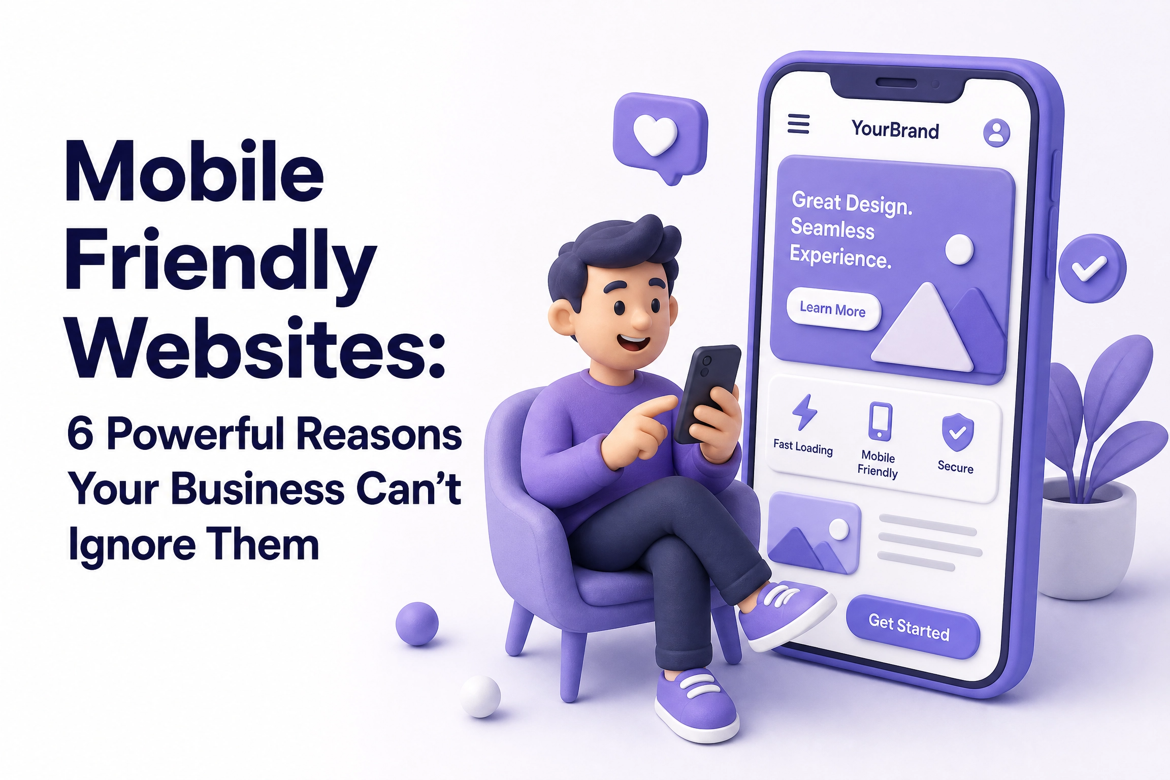
Someone finds your business on Google while sitting in a rickshaw, waiting for their order to arrive, or killing time between meetings. They tap your link. The page loads slowly, the text is tiny, buttons are crammed together, and they have to zoom and scroll sideways just to read your services.
They close the tab. You never know they were there.
This happens to businesses with non-mobile-friendly websites hundreds of times a day. Silently. Repeatedly. And it’s one of the most fixable problems in digital marketing, yet most small business owners don’t even know it’s happening to them.
What “Mobile-Friendly” Actually Means
A mobile-friendly website isn’t just a desktop site squished onto a smaller screen. It’s a site that was designed or properly adapted to work smoothly on a phone, with:
- Text that’s readable without zooming
- Buttons big enough to tap with a thumb
- Images that scale correctly to the screen
- Navigation that doesn’t require a mouse to use
- Pages that load fast even on a slower mobile connection
This is also called responsive design, the layout responds and adjusts depending on whatever screen is being used. A site can look perfect on a laptop and be completely broken on a phone. That’s the problem millions of business websites still have.
How Big Is Mobile Traffic Really?
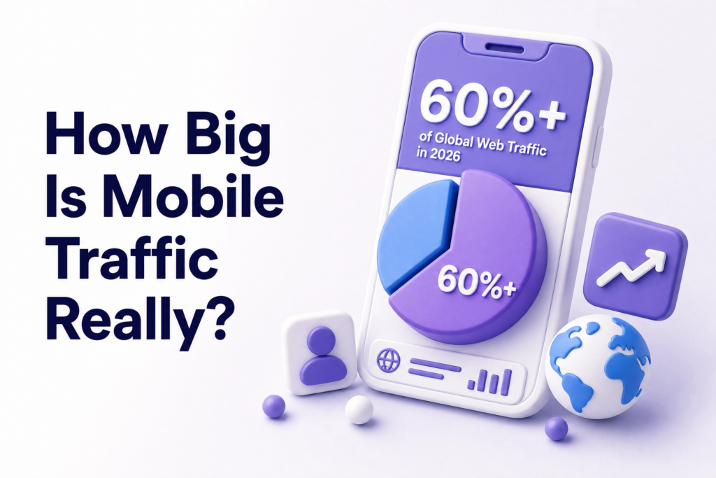
Over 60% of global web traffic now comes from mobile devices. For local businesses especially, that number is likely even higher, people searching for nearby services, checking hours, looking for contact numbers, all done on a phone, usually on the go.
76% of people who search for something nearby on their phone visit a business within a day. That’s not passive browsing. That’s someone who is ready to act and your website is their first stop.
If your site fails them in those first few seconds, that intent disappears. They don’t reschedule. They just tap back and try the next result.
6 Reasons Mobile-Friendly Websites Matter More Than Ever
1. Google Ranks Your Mobile Version First
This is the one most business owners don’t realize until it’s too late.
Google switched to mobile-first indexing, meaning when it crawls and ranks your website, it primarily looks at your mobile version not the desktop version you probably spent more time on. If your website isn’t mobile-friendly, it might land on page two of search results instead of the first page.
So even if your desktop site is clean, well-written, and full of useful content, if the mobile version is a mess, your rankings take the hit. You can verify exactly how Google sees your mobile site using Google’s Mobile-Friendly Test, it’s free and takes under a minute.
2. First Impressions Happen in Under a Second
Research from Google shows it takes about 50 milliseconds(half a blink) for someone to form an opinion about your website. On mobile, that impression is even more brutal because users are impatient and distracted.
A slow-loading, visually broken page on a phone doesn’t just feel inconvenient. It communicates something about your business. People assume, consciously or not, that a poorly functioning website means a poorly run business. Whether that’s fair or not doesn’t matter, it’s what happens.
When your site works smoothly on a phone, visitors are more likely to stay, explore, and take revenue-generating actions. The reverse is equally true.
3. Local Searches Drive Real-World Customers
Think about how people actually find local businesses. They search “hotel in Pahalgam,” “web designer near me,” or “best tour package from Srinagar”, mostly on their phones, often minutes before making a decision.
78% of mobile local searches result in an offline purchase within 24 hours. That’s an extraordinary stat. It means mobile isn’t just browsing behaviour, it’s buying behaviour. And if your site can’t handle that traffic properly, you’re handing those customers directly to whoever shows up next.
4. A Poor Mobile Experience Destroys Conversions
Getting someone to your website is only half the work. Once they’re there, the site needs to actually convert them: get them to call, fill out a form, or make a purchase.
Mobile-optimized sites see a 32% higher conversion rate than those that aren’t. That difference comes down to small things that matter enormously: a phone number that’s clickable and calls directly, a contact form that doesn’t require zooming and squinting, a menu that doesn’t require three attempts to open.
One extra tap of frustration is often enough to make someone give up. Mobile-friendly design removes those moments of friction entirely.
5. Your Competitors Are Already Mobile-Optimized
Here’s the uncomfortable truth: if your website isn’t mobile-friendly, and your competitor’s website is, you’ve already lost that comparison before the customer has read a single word about your actual services.
People don’t make a conscious judgment. They just feel the difference. One site feels smooth and professional. The other feels outdated and difficult. The smoother one gets the inquiry.
Businesses that prioritize mobile aren’t just following trends, they’re driving real, measurable business growth. A mobile-ready site isn’t a nice detail. It’s a competitive edge that’s growing more significant every year.
6. It Directly Affects Your Ad Spend
If you’re running Google Ads or Meta Ads and sending traffic to a non-mobile-friendly landing page, you’re wasting a significant portion of that budget. Most ad traffic comes from mobile. If that traffic arrives at a broken mobile experience, those clicks, each one costing money, convert at a fraction of what they should.
Better mobile experience means better Quality Score on Google Ads, which means lower cost per click and better ad placement. The site and the ad campaign aren’t separate; they feed each other.
What a Bad Mobile Experience Actually Feels Like
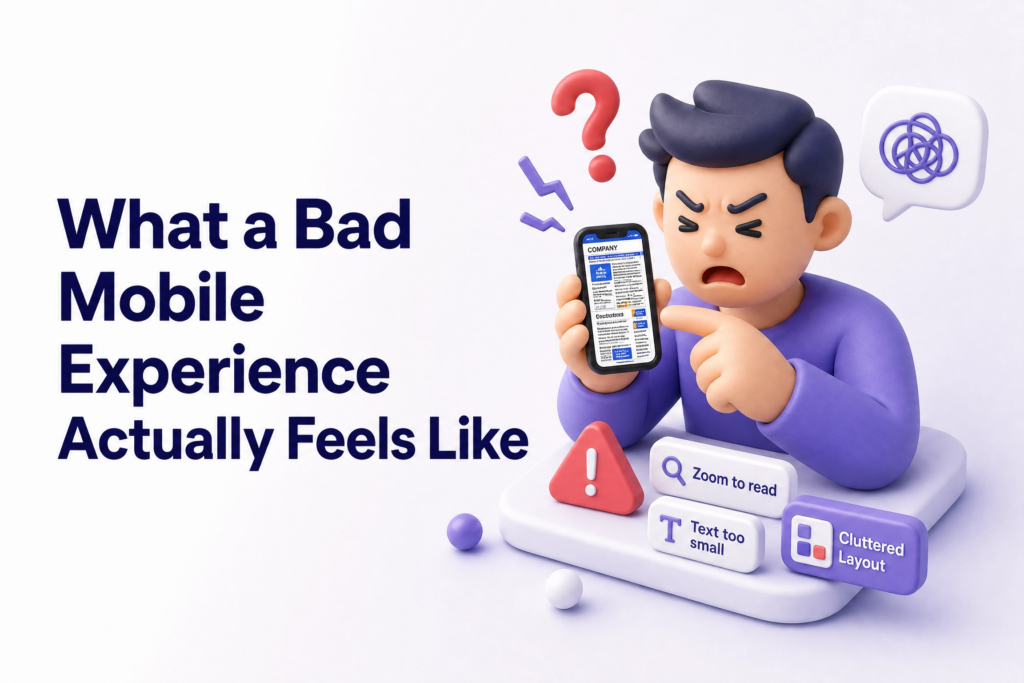
Let’s be specific, because most articles skip this part.
You visit a site on your phone. The logo is enormous and takes up half the screen. The navigation menu is a horizontal bar that you can’t see fully without scrolling sideways. The “Contact Us” button is a tiny underlined link buried in a paragraph. The phone number isn’t clickable, you have to memorize it, switch apps, and dial manually.
Nobody does that. Nobody has time for that.
That’s not a hypothetical. That’s the actual experience of visiting thousands of small business websites on mobile right now. And those businesses are losing customers every single day without realising it.
Common Mistakes Businesses Make With Mobile Design
Testing only on desktop. You build and preview on a laptop and assume it’ll look fine on phones. It often doesn’t. Always check on an actual phone and ideally on a few different ones.
Oversized images. High-resolution images that look sharp on desktop become slow-loading problems on mobile networks. Compress every image before uploading.
Popup forms that cover the whole screen. Popups that are manageable on desktop become screen-blocking nightmares on mobile. If someone can’t close your popup easily, they’ll close your tab instead.
Menus with too many items. Desktop navigation with eight menu items becomes an unusable mess on a small screen. Mobile menus should be simple ideally three to five core items.
Assuming your site is fine. The most expensive mistake. If you haven’t tested it recently, test it today.
How to Check If Your Website Is Mobile-Friendly
Three free tools that give you real answers in minutes:
- Google Mobile-Friendly Test: tells you directly whether Google considers your site mobile-friendly
- Google PageSpeed Insights: shows your mobile load speed and specific issues slowing it down
- Your own phone: the most honest test of all. Open your site, try to navigate it naturally, and notice where you feel friction
If what you find makes you uncomfortable, that discomfort is useful information.
What You Can Do Right Now
- Open your website on your phone and try to find your contact number in under ten seconds
- Run a free check at Google’s Mobile-Friendly Test
- Check that your phone number is a clickable link (tap-to-call)
- Make sure your contact form works properly on mobile, fill it in yourself
- Compress any large images using a free tool like TinyPNG
If your site passes these checks comfortably, you’re in decent shape. If it doesn’t, every day you wait is another day of lost visitors and missed inquiries.
At ElySpace, we build websites that are designed mobile-first not patched for mobile as an afterthought. If your current site is struggling on phones and you’re not sure where to start, we can help you figure out exactly what it needs.
Feel Free to Call Our Warm Sales Team: +91 9103853627
FAQs (Frequently Asked Questions)
What makes a website mobile-friendly? A mobile-friendly website automatically adjusts its layout, text size, and navigation to work properly on smaller screens. Text should be readable without zooming, buttons should be easy to tap, and pages should load quickly, ideally under three seconds.
Does a mobile-friendly website help with SEO? Directly, yes. Google uses mobile-first indexing, meaning it evaluates your mobile version when determining your rankings. A poor mobile experience hurts your visibility in search results regardless of how good your desktop site is.
How do I make my existing website mobile-friendly? The simplest approach is switching to a responsive design framework so the layout adapts automatically. If your site is on WordPress, switching to a modern responsive theme helps significantly. For deeper issues, speed, navigation structure, image optimization: a proper audit or rebuild is often the most efficient path.
Is a mobile-friendly website expensive to build? Not necessarily. A well-built responsive website doesn’t cost more than a non-responsive one, it’s about how it’s built, not how much it costs. What’s expensive is the revenue lost from a site that doesn’t work on mobile.
My site looks fine on my phone does that mean it’s mobile-friendly? Not always. Run it through Google’s Mobile-Friendly Test to be sure. Visual appearance isn’t the only factor: load speed, touch targets, and how Google’s crawler reads the page all matter too.
What’s the difference between responsive design and mobile-friendly? Responsive design is the technical method, the site’s code adapts to different screen sizes. Mobile-friendly is the outcome, the experience a phone user actually has. You can have a “responsive” site that’s still frustrating on mobile if speed, navigation, and content aren’t properly handled.